PROJECT #prettyinpurple
Kids rooms are so fun to design for. They are the perfect space to experiment with color and pattern. So I am going to take you behind-the-scenes of an E-design project for a little girl that it is filled with pattern and color! Take a look at the BEFORE photos…….
This space needed to be turned into a little girl’s nursery. The interesting part is that is didn’t need to have a crib because the parents wanted to create a space she could grow into, so a queen bed was requested. Some of the other design requests were:
Space for a changing pad for easy diaper changes
Incorporate green to flow with the color scheme of the existing Jack and Jill Bathroom
Blackout curtains
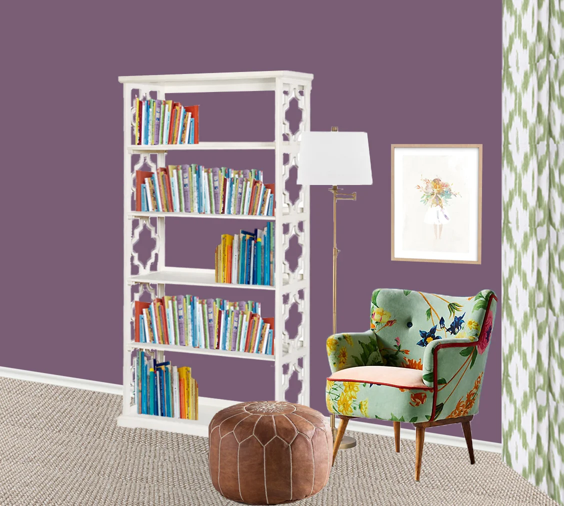
Storage for lots of books
Likes purple
I was so excited to start designing this space. I knew this client wasn’t afraid of color so I wanted to create a stunning space that was a little unexpected. Take a look at the FINAL design….
I decided to start with white furniture for the the majority of the main furniture because it would make the room feel more feminine and bright. Also, they would really pop against the purple walls. Next, I choose only 2 really bold pieces for the room: the bed and chair. These 2 are so unexpected because people usually go neutral and conservative for large pieces.
Next, I wanted to incorporate a lot of different patterns to add more interest and soften up the bold colors of the wall and bed. My tip for using 3 different patterns in a room is to be aware of their scale and to add a variety of patterns. These 3 all work well together because they are different colors, different patterns and in different sizes.
Custom Window Treatments (comforter is Anthropologie + rug is Rugs USA which are no longer available)
This room was full of soft fabrics and feminine colors so it really needed a few contrasting textures to warm it up. The overhead lighting created a beautiful contrast against the soft, green bed. The pouf added in a worn-in look and inviting texture to the room.
For the accessories, I added a few pops of pink. Pink plays really well with a purple and green color scheme. All of the decor added a whimsical, girly look that toned down the adult-feel of the furniture. Overall, I loved how FUN and BOLD this room turned out!
Do you have a room that needs a new look? Start a project with me HERE!


